With each passing day, more and more people are buying stuff online.
They can’t help it. The convenience and simplicity are just too alluring.
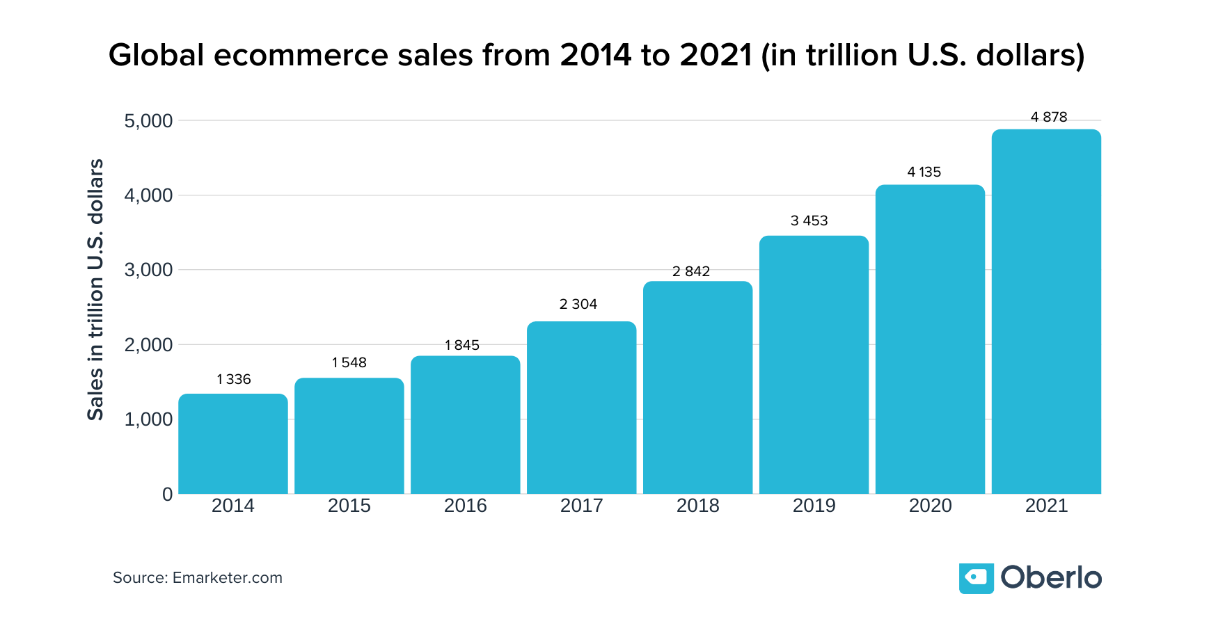
It’s projected that global retail ecommerce sales will hit $4.8 trillion by 2021 – more than double its $2.3 trillion value in 2017.
This steady boom in online shopping means massive opportunities for aspiring ecommerce entrepreneurs. But it also means massive competition from everyone else who wants a slice for themselves.
Because your product page is the last thing a visitor will see before they decide to make a purchase – or lose interest and leave – it’s one of the most important pages of your whole store.
Fortunately, there are thousands of stores that serve as shining examples of how to do it right.
And we’re going to explore a few of the best product pages out there.
In this chapter, we’ll:
- Look at six Shopify stores with the best product pages
- Dig into specific elements and what makes them so enticing
- Suggest a few Shopify themes you can use to build your own
Let’s get to it.

6 exceptional product page designs
1. Rocky Mountain Soap
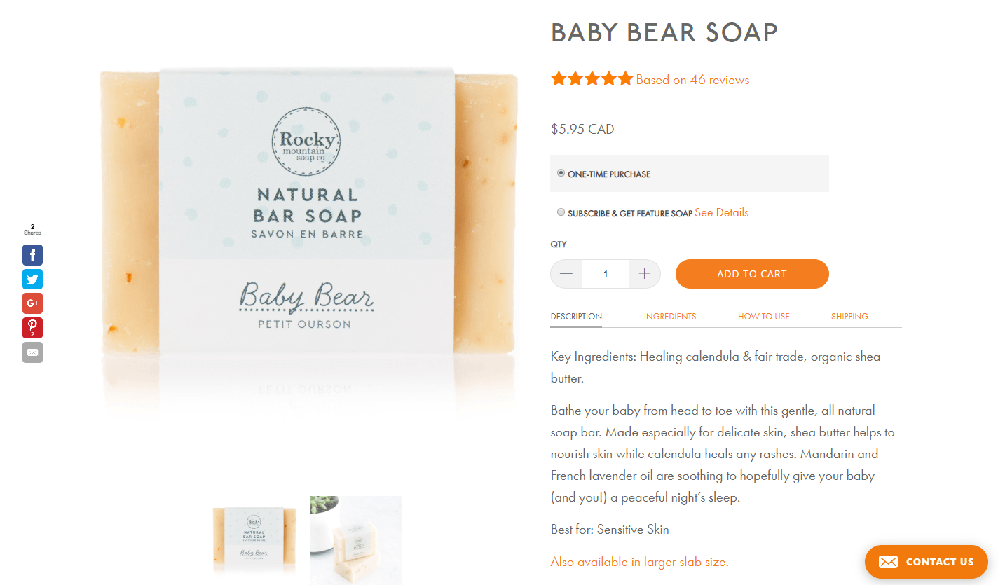
Rocky Mountain Soap has a clean, simple, and dare we say classic product page design.
→ Click Here to Launch Your Online Business with Shopify
It’s mostly white, but uses the brand’s signature earthy orange tone to highlight important elements, like the “Add to cart” and “Contact us” buttons, along with headings and clickable links.
Their brand is geared toward consumers who want pure and natural ingredients, which is why they focus heavily on this concept in their product descriptions. There’s a designated “Ingredients” tab, as well as a tab explaining how to use their products and a tab for shipping.
This Baby Bear Soap page uses sought-after terms like healing, fair trade, organic, and natural.
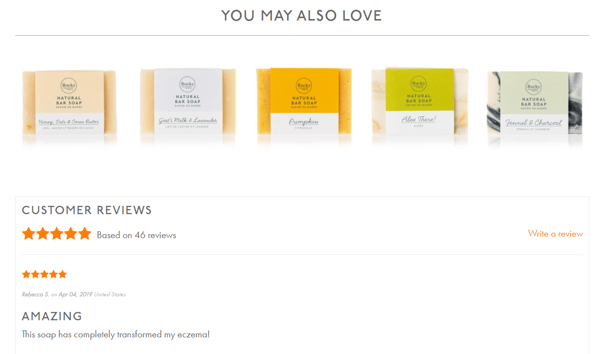
Below the fold, they recommend similar products to snatch some cross-sales, then go straight into their impressive product reviews.
When your products have 46 five-star reviews, it’s safe to say you’ve got a pretty awesome product and brand as a whole.
2. Argent
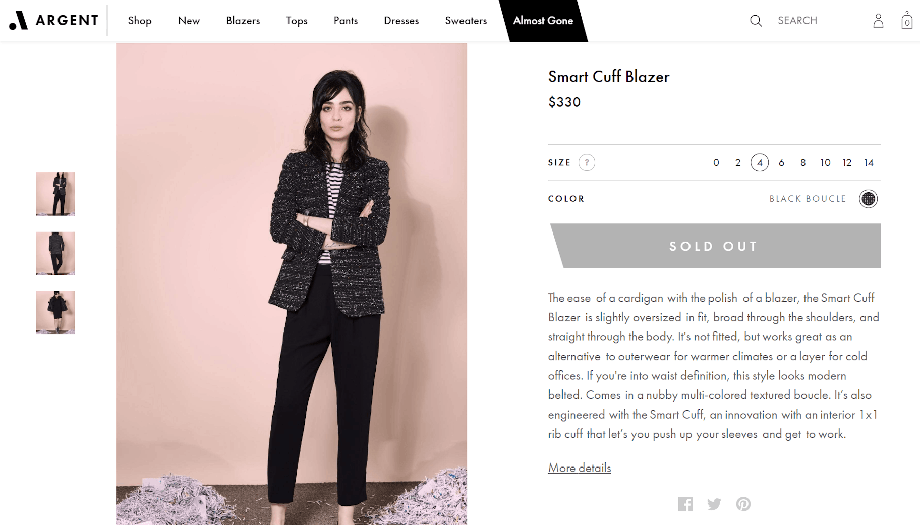
Argent has one of the best product page ideas for creating a sense of scarcity and urgency.
In the main navigation of their ecommerce website design, there’s an “Almost Gone” tab.
While most websites use more indirect language like “Limited availability,” this word choice seems to pack more of a punch in getting the point across.
When you click through certain sizes, you’ll see that the black “Add to bag” button turns into a gray “Sold out” button, which reinforces the scarcity of this product and naturally boosts the shopper’s sense of urgency.
The product description is impressively precise in describing how it will fit and how customers can use it, saying things like: It’s not fitted, but works great as an alternative to outerwear for warmer climates or a layer for cold offices.
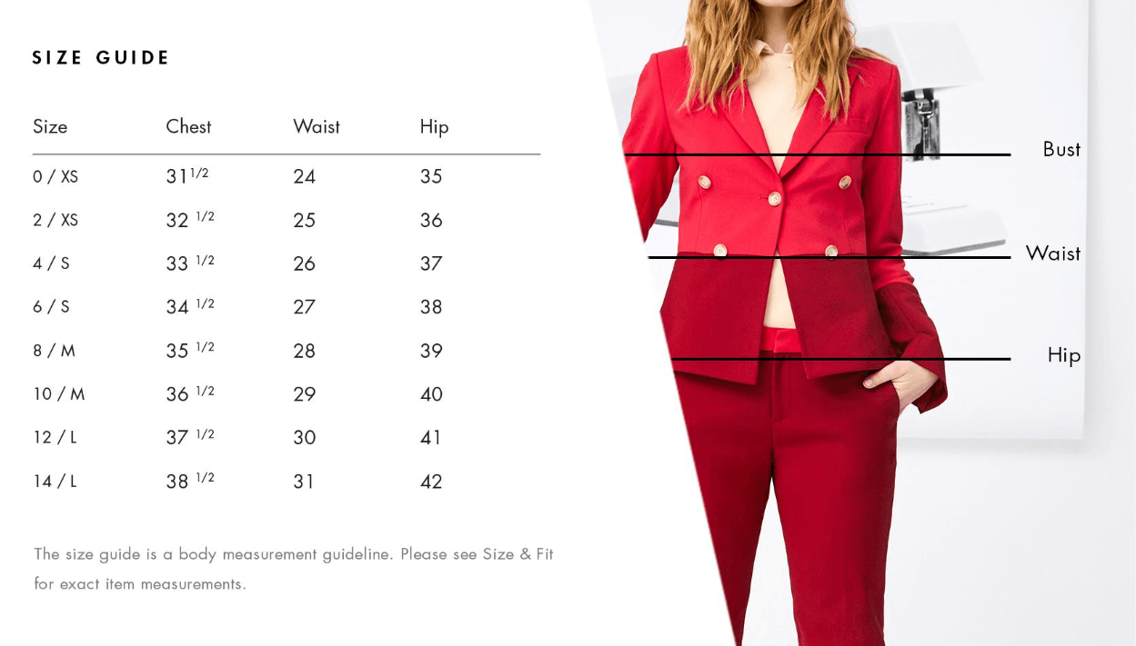
It also includes a detailed size guide, helping to eliminate the biggest problem with online shopping.
At the bottom of the page, you’ll find recommendations for other Argent items that pair well. Smooth cross-sell.
With its high price point, Argent does a great job of enforcing their products’ value while showing that they’re committed to customer satisfaction.
3. Thing Industries
Thing Industries has a lot of personality, and it really shines through in the company’s ecommerce website design.
It sells quirky products like banana-shaped pillows, birdhouse bookshelves, and wall hooks that look like boobs.
The website is image-heavy, putting its primary focus on bright, minimalist product photos shot in portrait orientation (meaning they’re taller than they are wide) that take up most of the screen and are designed to look great on mobile. They show the product in action with various uses, like as a keychain or bag holder.
As you scroll down the page, the product photos are lined up all the way down so you can see them in all their glory.
The product descriptions are simple and non-persuasive, because let’s face it – these are the kinds of products that more or less speak for themselves.
4. Leesa
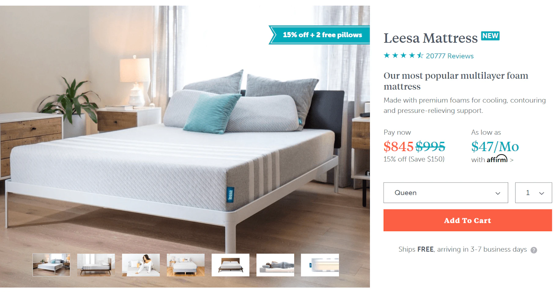
When looking at buying a big-ticket item, consumers generally need more information and confidence in the product as compared to when they’re making smaller purchases.
At around $1,000, the Leesa mattress is a ringer for this necessity.
Leesa has one of the best product pages when it comes to providing substance around the product and addressing every possible concern that shoppers might have.
Above the fold, the product page design uses the brand’s teal and orange colors for accents on important items like price and the Affirm payment plan option.
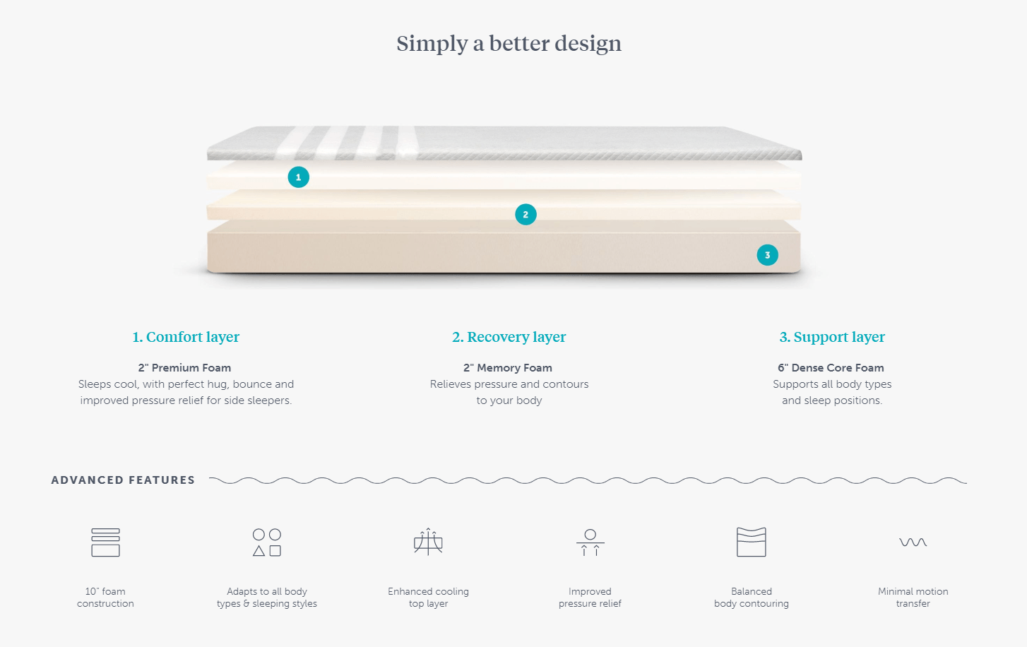
As you scroll, you see beautiful custom graphics showing the composition of the mattress and its features. There are several sections that continue illustrating the benefits with the use of graphics and product photography.
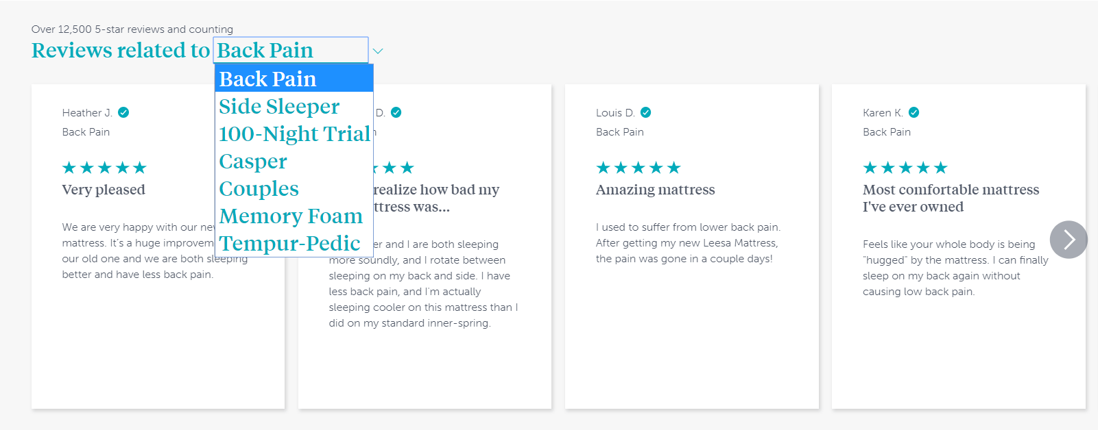
You can even sort through reviews based on the category. Talk about going the extra mile.
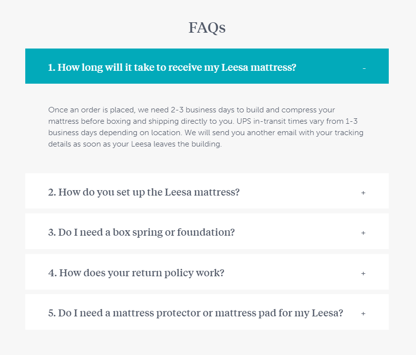
And at the bottom, the FAQ section seals the deal.
It’s clear that Leesa has one of the best product pages – one where the design is a testament to their superior products.
5. 69
We talk a lot about best practices and guidelines, but sometimes, the rules are meant to be broken.
69 is a perfect example of an ecommerce website design that glances at the rulebook, pauses for a minute, and then gives it the middle finger. The result? One of the most eye-catching and best product pages.
Visitors can see this immediately, especially with the animated homepage that shows the models moving slightly while staring at you uncomfortably.
Instead of the logo and navigation at the top, they’ve placed the logo to the left of the screen and the navigation to the right.
The product pages solidify the brand’s irreverent personality. They’re supremely clean, simple, and direct with a black-and-white theme and very little fluff.
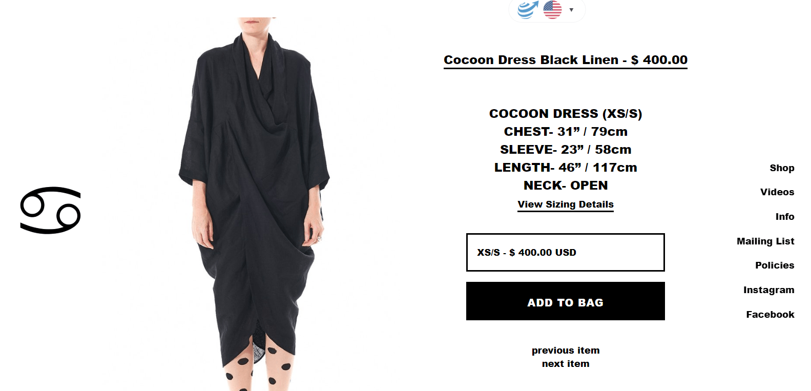
As a bonus to the heavy branding benefits, this technique leaves little room for shoppers to get distracted.
Overall, this is a refreshing reminder that you can find success off the beaten path, and that some of the best product pages break all the rules.
6. PRESS London
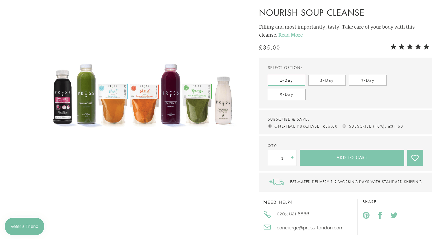
PRESS London has a different business model than your average ecommerce store, and it shows in the company’s product page design.
Ideally, they want customers to come back for regular juice cleanses, so customer support – in addition to cost and quality emphasis – is important.
To emphasize the cost value, there’s a “Subscribe & save” section that shows a 10% discount on a subscription versus a one-time purchase.
To reinforce the support element, there’s an icon that shows a 1-2 day estimated delivery, as well as a customer service phone number and email.
The brand also has a strong social element, with icons for shoppers to share the products on social media. The product page design also includes a “Refer a friend” referral program button at the bottom left of the screen.
Below the scroll, you can see descriptions and ingredients for all products (which is absolutely critical for consumables – especially ones that promote health), as well as tabs to see delivery details, product reviews, and commonly asked questions.
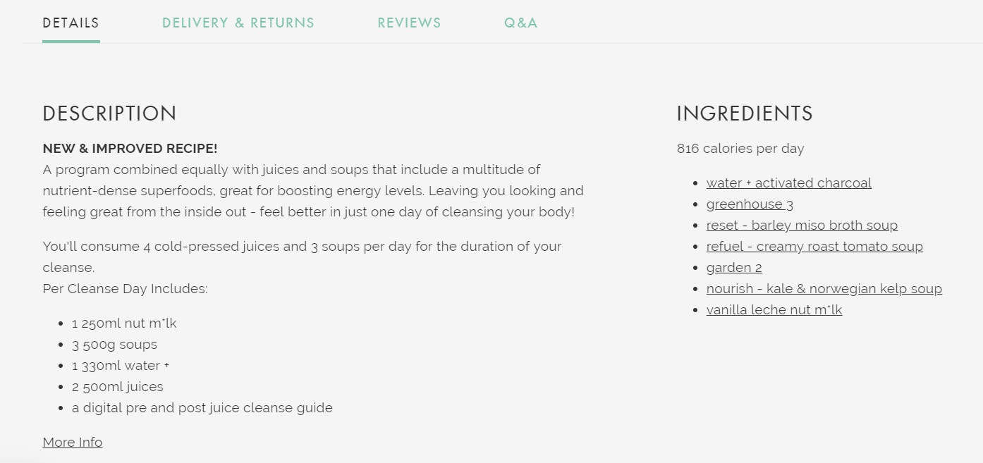
Overall, PRESS has a sleek ecommerce website design that makes good use of the brand’s serene green color. As you remember from Chapter 1’s introduction to the product page, green is a key symbol of health and wellness.
We feel healthier just looking at it.
Now that you’ve seen a few of the very best product pages, let’s run through some Shopify themes that will help you create your own beautiful store with minimal hassle.
Shopify themes for high-converting ecommerce website design
Your theme can be a make-or-break factor in your store’s success. The right theme can take a good ecommerce website design and turn it into one of the best product pages out there.
In the olden days – when you had to walk 15 miles in the snow to get to school every morning – a good ecommerce website design meant spending thousands of dollars and needing a professional web developer for even the smallest changes.
But today, Shopify makes it incredibly simple to drag-and-drop your way to a store that can compete with big brand names.
On the official Shopify themes marketplace, there are dozens of to choose from, all optimized for both desktop and mobile. There are also loads of general marketplaces and independent developers where you can find thousands more.
You can browse the official marketplace by collections, like:
- Trending this week: to see what’s fresh
- Minimalist style: for a clean, simple vibe
- Fun and lively: for a brand with more personality
- Big, beautiful images: if you want to flaunt your product images
- Great for large inventories: if you’re selling a high volume of products
- Great for small inventories: if you’re only selling a handful products
You can also choose themes that are specially made for certain industries, like clothing & fashion, electronics, health & beauty, furniture, and more.
If you have specific design or marketing tactics you want to implement, check out the “All Themes’ page. You can sort through themes based on the layout style, homepage and product page features, navigation styles, and marketing and social media features.
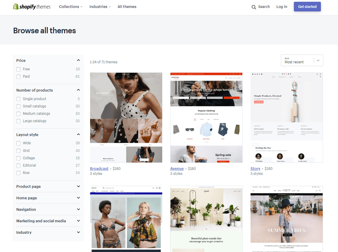
Here are a few high-converting free and paid themes from the official marketplace to check out for your new store.
Pro tip: Be sure to check out the demos and scroll to the bottom of each theme’s page, where you can see a few real Shopify stores that use it.
Free themes
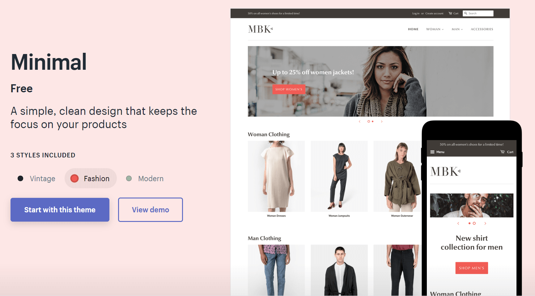
A reliable theme that avoids clutter. It’s available in a Vintage, Fashion, and Modern style, and is ideal for new ecommerce entrepreneurs who are just learning the ropes.
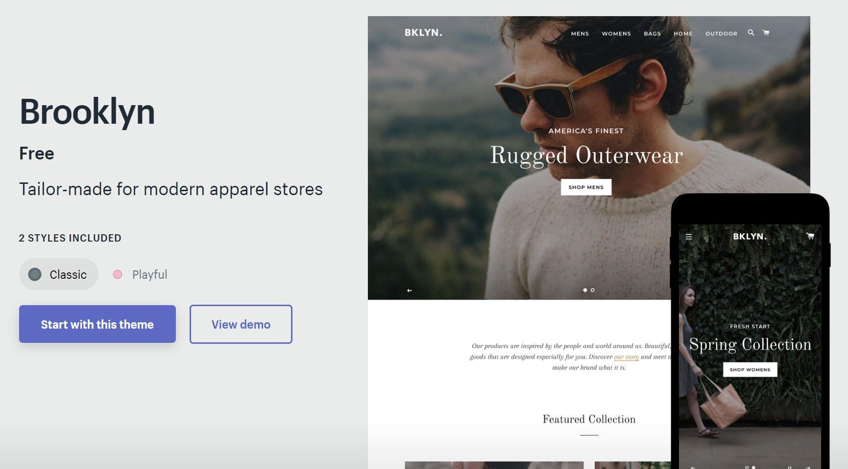
Another simple theme that makes a good launching pad for beginners. It comes in Classic and Playful style.
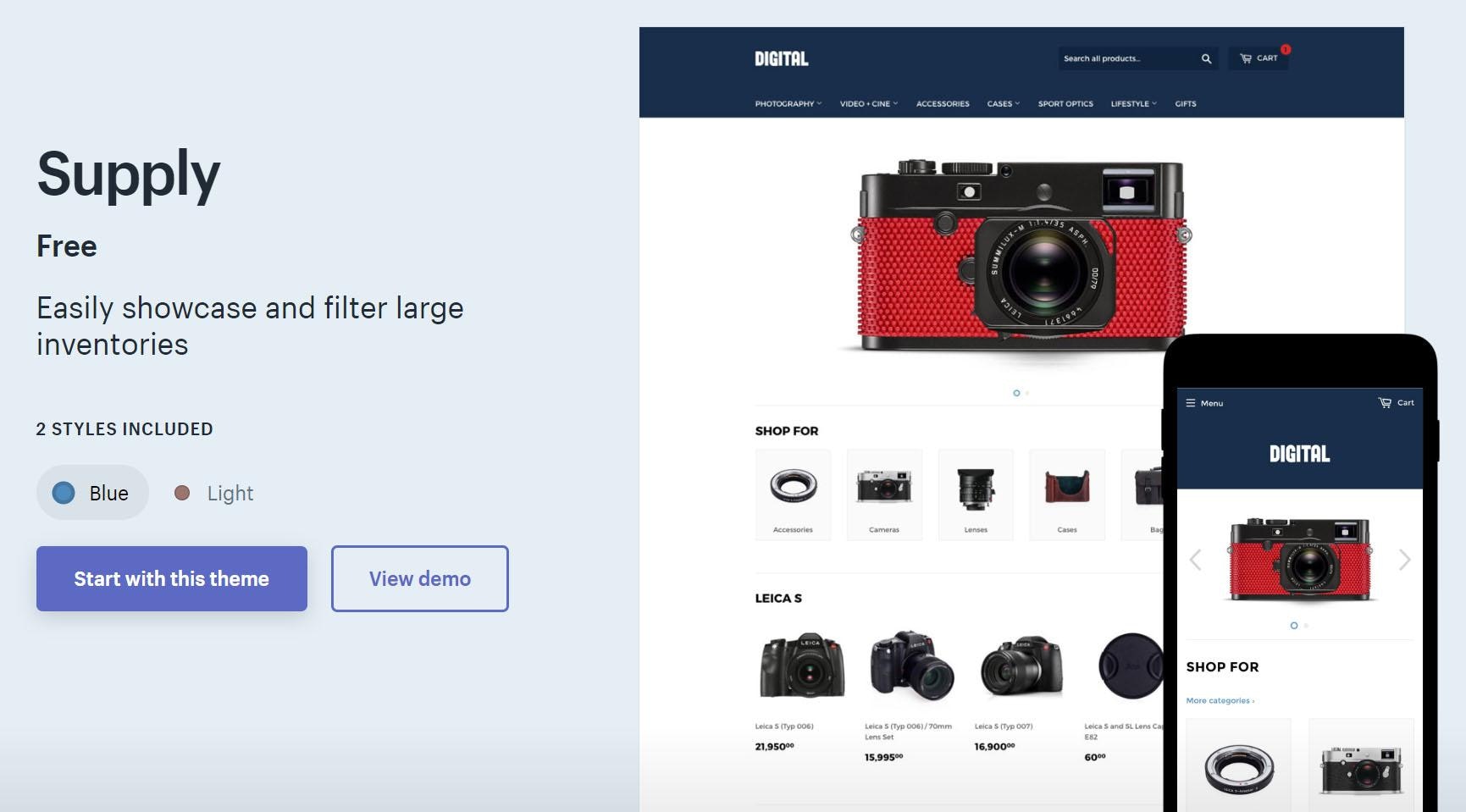
Designed for large inventories, Supply comes in a Blue and Light style. Don’t let the name fool you – you can easily customize for your brand colors and other elements, just like the rest of Shopify’s themes.
Paid themes
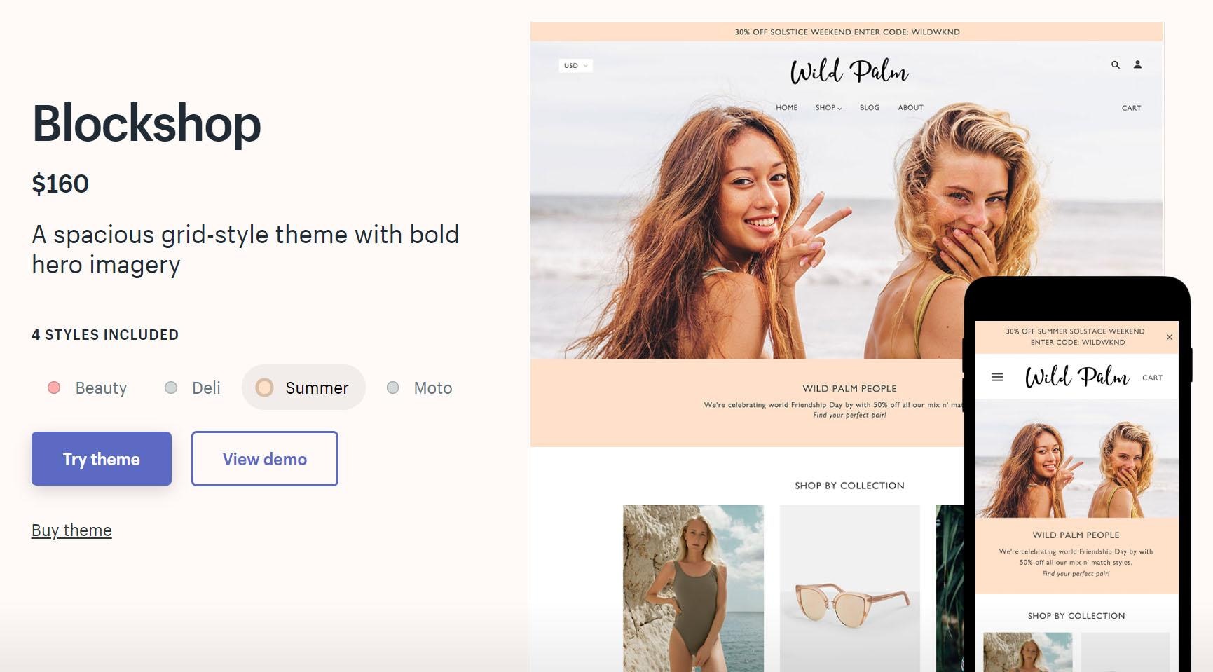
Blockshop ($160)
Blockshop was made for beautiful product photography, boldly showcasing your hero image at the top of the homepage. It comes in four styles, all with minimal user interface (UI) to focus on your products. It’s a good choice for fashion stores, as it has size chart and product recommendation features built in.
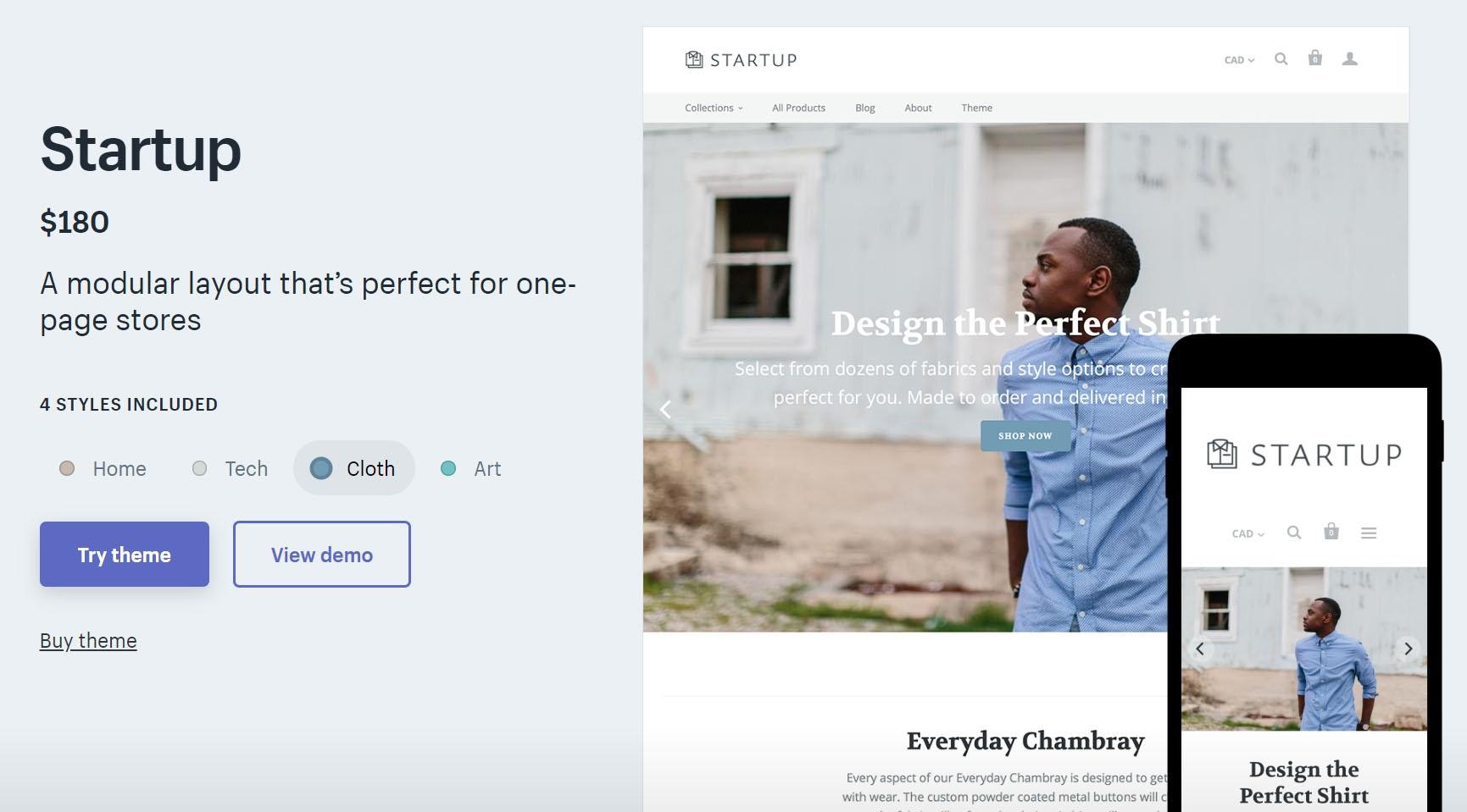
Startup ($180)
Available in four styles, Startup is ideal for one-page stores or stores with small inventories. But its impressive level of flexibility and detail make it powerful enough for large-catalogue websites, too.
Parallax ($180)
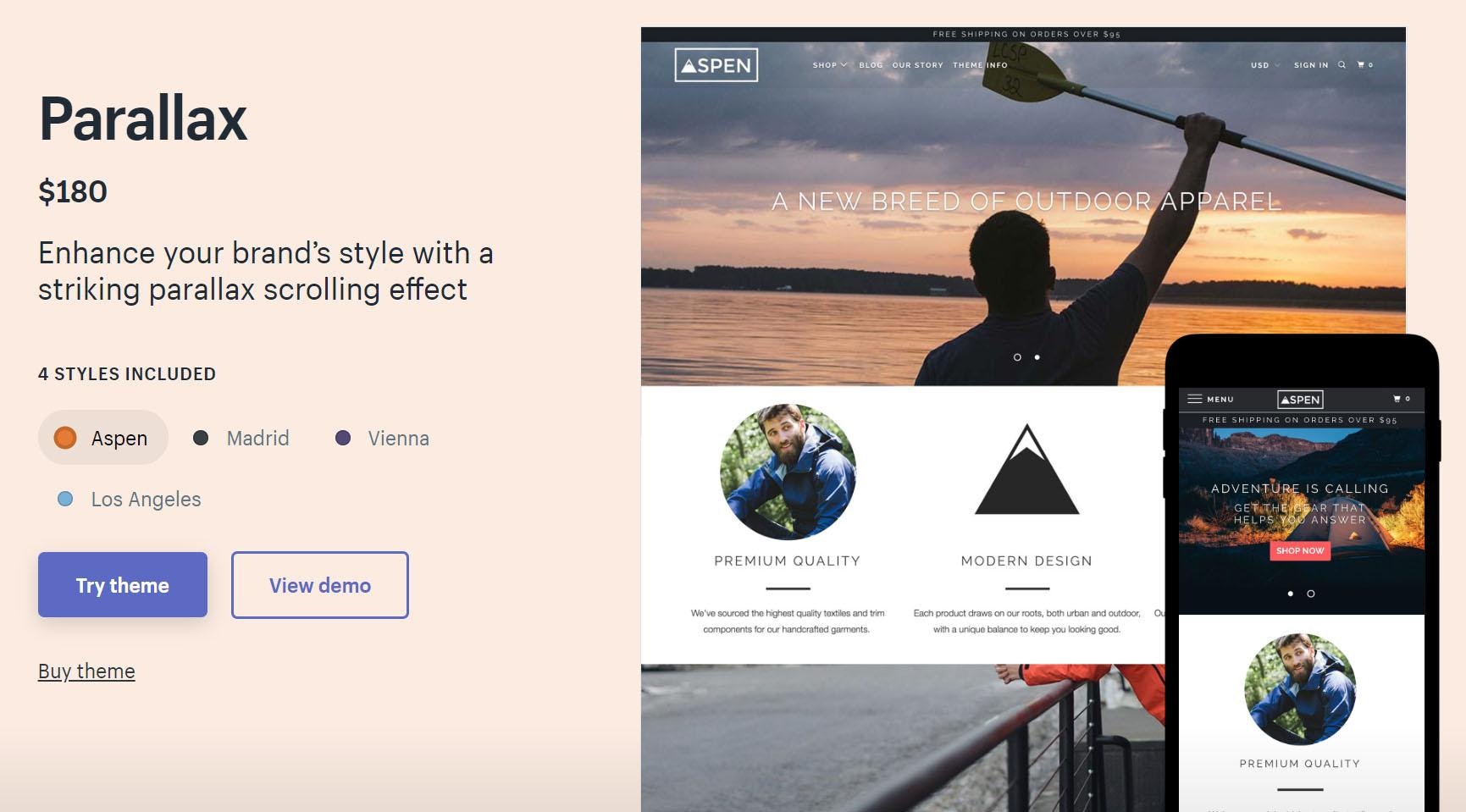
This theme is aptly named, as it uses an ecommerce website design effect called parallax. As the user scrolls down the page, the background images move slower than the foreground section, creating a unique and eye-catching store. Parallax is available in four fun styles.


Conclusion
Well, folks, that’s a wrap.
In this ebook, we’ve covered:
- What a product page is, including different types and their basic anatomy
- How to write product descriptions that connect with your visitors and compel them to buy
- The ins and outs of taking beautiful product images that enforce your brand’s story
- How to use product videos to showcase your products and engage visitors
- A list of some of the best product pages on Shopify and how you can grow up to be just like them
We hope you’re feeling inspired, empowered, and ready to slay with your own dropshipping store – complete with product pages that delight and convert.
If you’re ready to take the leap, we’ve got just the thing – an online course that will bring you from ground zero to your first sale in just 21 days.

